Tuesday, June 1, 2010
Week 9 Lab: Census 2000/2010
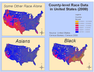
Being able to access Census data from the United States can help explain many things regarding race, ethnicity, and occupation, among other important topics. By mapping racial data for this week’s lab, I can now better see where cultural enclaves exist and can start to explain why things are the way they racially are in America. As a scholar of history, where someone lives can explain a lot around his or her family background and this lab is especially fascinating due to that fact.
Blacks:
Out of 307 million American citizens, 37 million are categorized as African Americans. African American history in the United States unfortunately starts in the 17th century as indentured servants and slaves predominantly in the South. While African Americans are free today, their communities often disproportionally suffer from poverty, failing schools, and crime. As it is easily discernible from the map, a high proportion of African American communities preside in the South and Gulf Coast in states like Louisiana, Virginia, North and South Carolina, Mississippi, and Alabama. The high proportion of blacks in these areas can be traced back to the slavery era and is a sad reminder of America's past.
Asians:
There are almost 11 million Asian Americans and as can be easily seen, most of them reside in coastal areas like California and New York. With Asian Americans being only 5% of the population, counties in the Bay Area and near Los Angeles can be between 10%-25% Asian. The most obvious reason to why Asian communities would be predominantly on the West Coast is a result of geography. China and Japan lie on the Pacific Ocean (as does the West Coast) and throughout the 20th century, people have been coming over from the Pacific Rim via boat and airplane.
Some Other Race:
The "Some Other Race" category is an aggregation of all people whose responses don't fall into the categories of ”White,” “Black or African American,” “American Indian and Alaska Native,” “Asian,” and “Native Hawaiian and Other Pacific Islander.” This category mainly consists of Latino(a) people. As is obvious in the map, a majority of this category resides in the California and the South West (Arizona, Texas, New Mexico, Nevada). According the United States Census Bureau, 97% of respondents within the "Some Other Race" category are Latino(a). The reason for the spatial dispersion of this category is due to the majority of respondents being Latino(a) and the proximity of Mexico and other Central and South American countries to the American Southwest. Also, those are areas where there is already a fairly populous Latin American community with many established cultural centers.
GIS is an amazingly powerful tool that relies on not only a powerful computer, but also a savvy user. Through working with ArcGIS this quarter, I have realized the capabilities of this program yet only feel like I have just scratched the surface of the study. While I am not a geography major, I am exposed to maps everyday being an avid reader of news periodicals and by taking this class I finally understand how maps are made, what they mean, how they are professionally expressed, and most importantly how I can make maps myself. Maps help people understand the world and by taking this class I have enriched my education as to how the world looks and is organized.
Thursday, May 20, 2010
Week 8 Lab: Mapping the Station Fire in ArcGIS
From August 26th to October 16th 2009, 251 square miles (160,577 acres) of the Angeles National Forest were burned in the larges forest fire in Los Angeles history and the 10th largest in California state history (http://inciweb.org/incident/article/9640/). The damage by the time the fire was contained included the lives of two firefighters and 89 homes and cost $93.8 million to battle (http://inciweb.org/incident/article/9640/). The fire threatened an additional 12,000 structures in the Angeles National Forest and the nearby communities of La CaƱada Flintridge, Glendale, Acton, La Crescenta, Littlerock, Altadena, Sunland and Tujunga.
County Fire Department Capt. Jerry Meehan said that this fire was "the biggest ever" and that the flames could reach 300 to 400 feet high. Meehan also added that, "This is the hottest-burning, most damaging I've seen" (LA Times http://latimesblogs.latimes.com/lanow/2009/09/station-fire-is-largest-in-la-county-history.html). The starting of the fire is suspected to be arson, but still to this date no one has been charged. If someone is convicted, they face the possibility of a death sentence since the fire killed two firefighters.
While the Station Fire was extremely destructive in the 251 square miles that it scorched, the effects were felt well beyond just the burn-zone. Fire creates smoke and smoke is made up of water vapor but also harmful gasses and particulate matter like carbon monoxide, carbon dioxide, nitrogen oxide, irritant volatile organic compounds, toxic air pollutants and very small particles (http://www.deq.idaho.gov/air/prog_issues/burning/emerg_rule_fs.pdf). In smoke, the particles can build up in the respiratory system and case numerous health problems like burning eyes, runny noses, and bronchitis and can also aggravate existing heart and lung diseases like heart failure, chronic obstructive pulmonary diseases, emphysema, and asthma. It should be noted too that children and the elderly are more susceptible to the smoke caused by these fires and it is highly advised not to recreate near forest fires. (http://www.deq.idaho.gov/air/prog_issues/burning/emerg_rule_fs.pdf).
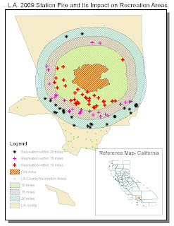
With the harmful effects to the body from smoke described above, it is easy to see why it is so harmful to recreate, or in extreme cases like this, even go outside into the environment when there is such an intense forest fire. The American Lung Associate states that: "If you live close to or in the surrounding area, it's recommended that you refrain from exercising outdoors, especially if you smell smoke or notice eye or throat irritation" (http://www.lungusa.org/healthy-air/outdoor/protecting-your-health/what-makes-air-unhealthy/forest-fires-respiratory-health-fact-sheet.html). In the above map, which shows the fire area and distances 10, 15, and 20 miles away in addition to all the recreation areas in Los Angeles County, it is definitely recommended for people who normally recreate within the buffer zones to stop for the duration of the fire. As you can see, a majority of the Los Angeles Country recreation areas lie within the 20 mile buffer, meaning that from August 26th to October 16th, a majority of Angelinos who normally frequent those spots either stopped recreating or braved the harmful effects of exercising in such close proximity to the fire. Even at UCLA during the fire, it was recommended by local health officials to not engage in heavy exercise routines to avoid respiratory aggravation.
The fire adversely affected recreation in Los Angeles Country from August 26th to October 16th 2009. Recreation is as much of a part of the Los Angeles lifestyle as anything in the region and fire not only affected people’s enjoyment of the outdoors, but their overall health. People were warned in the region not to recreate or even to go outside, thus reducing their overall physical abilities. Those that did choose to use the Los Angeles Country recreational areas during that time period risked suffering respiratory problems. In addition to the lost physical activity due to the station fire, local recreation areas were charred and now an effort is underway to replant the trees that were destroyed (http://latimesblogs.latimes.com/lanow/2010/04/replanting-begins-for-millions-of-trees-burned-in-station-fire.html). Millions of trees burned in the Station fire last August and local communities surrounding the fire zone are now taking on the task of restoring the ecosystem and their local recreation areas.
View of the fire from Downtown Los Angeles
BIBLIOGRAPHY:
Bloomekatz, Ari B. "Station Fire Is Largest in L.A. County's Modern History | L.A. NOW | Los Angeles Times." LA Times. 2 Sept. 2009. Web. 24 May 2010.
Idaho Department of Environmental Quality. Air Pollution Emergency Rule: What Is It, What Does It Do? Idaho Department of Environmental Quality. 23 Dec. 2004. Web.
"InciWeb the Incident Information System: Station Fire News Release." InciWeb the Incident Information System: Current Incidents. Web. 24 May 2010.
O'Neil, Megan. "Replanting Begins for Millions of Trees Burned in Station Fire | L.A. NOW | Los Angeles Times." LA Times. 11 Apr. 2010. Web. 27 May 2010.
United States of America. American Lung Association. Web. 23 May 2010.
United States of America. Idaho Department of Environmental Quality. Web. 24 May 2010.
Thursday, May 13, 2010
Week 7 Lab: DEMs in ArcGIS
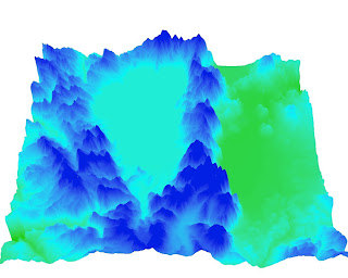
3D Map
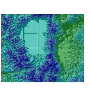
Shaded relief model of the area using a color-ramped DEM layered above a hillshade model
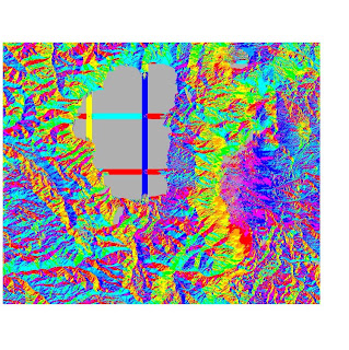
Aspect Map
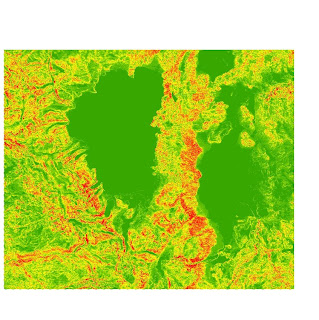
Slope Map with UTM Projection(Zone 11)
The area I chose for this week's lab was the Lake Tahoe area which lies on the boarder between California and Nevada. The geographic coordinates of South Lake Tahoe are 38°56′00″N 119°59′04″W. As an avid skiing and having visited Lake Tahoe many times, I thought this would be a great terrain to map slope, a shaded relief map, an aspect map, and a 3D map because of the interesting a greatly changing nature of the land. Starting from the lake level and going up to the peaks of many of the surrounding mountains and ski slopes, the elevation can change to the tune of thousands of feet vertically (y-axis) in a relative short distance (x-axis). The lake sits at an elevation of 6,225 feet above sea level and the mountain peaks rise to more than 10,000 feet above sea level. The region was created around 2 to 3 million years ago from geologic block faulting (to create the lake basin). To get a good look at the surrounding Lake Tahoe area, embedded below is an amateur video from one of the region's mountain peaks.
The region also has a thriving ecosystem, hundreds of miles of great hiking trails, top-notch ski slopes, and some of the most pristine waters in the world.
Top extent = 39.2908333328
Bottom extent = 38.7019444438
Left extent = -120.320277778
Right extent = -119.607222222
From the 1983 North American datum
Area = 4306545079.618 meters-squared
The pixel depth is 32 bit
Thursday, May 6, 2010
Lab 5: Projections in ArcGIS
The only thing changed in this lab is the map above. I lost my old map (a file saving error) and produced this one according to the criticisms from my last map below. Thanks!
This week's lab was very interesting, being that we had to use ArcGIS to create the "same" map, just with different projections. From the outside, it sounds easy to just create 6 maps with different projections, while in reality it was hardly that. This weeks lab was challenging for me in terms of creating a "pretty" format, but using the tools and skills I acquired in last weeks lab, it was much easier. Using last weeks skills, I created a map with different layers and used 6 different projections (2 conformal, 2 equidistant, and 2 equal area) and then measured the distances between 2 set points (Washington D.C. and Kabul, Afghanistan).
Map projections are important for a variety of reasons because they take a 3D earth and turn it into a 2D projection. Topography is the study of the earths surface, shape, and features and the map projections can preserve area (equal-area), distance (equi-distant) and angle/direction (conformal). Conformal maps will preserve direction and angle, equal area maps will preserve area, and equidistant maps will preserve distances between two points. Depending on the region of interest for the map user, we can tailor a map projection to make some features more accurate and less distorted. The first reason as to why map projections are important is because the distances between 2 points are different depending on what map projection you use and what datum you use. As you can see above, even with the same projection (for example conformal), the distances can vary by 200 miles. In the conformal case, I used the Mercator and Canada Lamber Conformal Conic and the distances were different to the tune of 199.2 miles!
When I created the map projections for equidistance, I purposely used two different datums that were across the world from each other so I could better see how different datums effected different projections. As you can see above, by using the equidistant conic, one from North America and the other from Asia, the distances between Washington D.C. and Kabul, Afghanistan were off by 161.8 miles! That is a significant distance (around 2.5% of total distance traveled between those two points), and interesting since one would think that all equidistant maps would give the same distances between two points. The reason why I believe the distances between these two maps are different are because of the different datums being used. As a pilot or someone that works in the aerospace industry, this difference just in using the correct data is very important in seeing how long a trip is going to be and even how much fuel to put in the aircraft tank so it doesn't run out of energy! It should be noted, however, that the equidistant maps were more similar in distance to each other than the other 2 projections.
Lastly, I thought the map projection of the US National Atlas Equal Distance was interesting because of the spherical look of the projection, almost preserving the same of the earth. When this map projection was compared with the Canada Albers Equal Area Conic, the distances between the two cities of note was the greatest of the three map projections, 640 miles. This is important to note because even though the two datum are from the same hemisphere, the distances are significantly different between the two points.
Monday, May 3, 2010
Lab 4: Introducing ArcMap
My experience with ArcMap has been a very positive one. The computer program is extremely complicated and complex and with this lab I only felt like I just scratched the surface of what this powerful program can do. ArcMap is a very well thought out program with few pitfalls. I would say that its extreme complexity is a pitfall being that it can take years to master, thus being discouraging for small, simple users. If I had to pinpoint one area in which I had difficulty in with this lab, it would be saving the program on the computer lab computers. Regarding the program, creating the graph was the most difficult part for me because I lost the data at first and had to redo that part. It has, however, showed me that you have to be extremely organized in how you work and operate ArcMap so that nothing gets lost in your program. Also, drawing the road was no easy task since you have to be accurate and precise. However, ArcMap is very useful with creating new streets and has several features that help the user accurately and efficiently add streets and other features to the map.
GIS has extreme potential for all sorts of users. GIS can be opened up for a variety of uses, from general education to urban planning to environmental research. Also, with the great programs like ArcMap, a user can become familiar with creating maps after working with it for only a few hours. ArcMap lets professionals and amateurs alike work with the power of GIS to get informed about communities and the world and manipulate maps and data with incredible power. As an amateurs, I greatly enjoyed using ArcMap and am excited to see its further powers and abilities and how it can enrich both my academic and professional life.
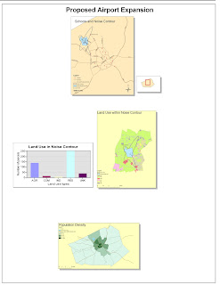
GIS also has a few pitfalls associated with it. First off, too much reliance on GIS can abstract from other real world phenomenon. While GIS does a great job of aggregating data, displaying it in a user friendly fashion, and help the user draw a conclusion, too much reliance on a map and not on human behavior and the nature in which it acts and changes can be devastating to research. Humans are more than what you just see on paper, so while you may see a noise contour affecting a neighborhood and automatically guess that it will bring down home prices in the region, further surveying data is needed to draw a solid conclusion. Researchers need to rely on other techniques besides just looking at data from a map like using economic valuations like contingent valuation or hedonic real estate valuation to see how prices of homes would actually react to an airport nearby. Like anything in life, if you look at it from one-dimension, you can lose the complexity, elegance, and reality of a situation and a user of GIS must be weary of that and take a holistic approach to research.
Also, there is more to GIS than just a map; and there is more to a map than just a few points of interest. The design plays a crucial part in the creation of a map. The design of a map deals with the scale of the map, points of interest, points of focus, projections, and aesthetics like neat-lines, shadows, where to place the legend and north arrow, among other features. Without a clean and thoughtful design, not only is it less professional but less people will be interested in what it has to say and the more confusing it will be for the viewer.
Thursday, April 15, 2010
Lab 3 Week 3
View Obama's Cabinet in a larger map
The above map is a map of where President Obama and his cabinet were born. It is interesting to see in the map that only 5 of the 15 cabinet members are from west of the Mississippi River, meaning that it is a mid-west and east-coast dominated cabinet (by birth). You can always tell a little bit about someone from where they were born and raised and I decided to create this map to see if there was any correlation between where members of the cabinet were from and the current political climate of that state. I can say confidently that almost every member of the President's cabinet was born in a state that voted for President Obama in 2008. In addition to where each member was born is a line to the White House, where they now work and meet with the President on a frequent basis.
Regarding nanogeography, the study and implementation has many positive and negative features associated with its use that is sure to shape the way we look at geography and maps. To start on the downside, one major downside of nanogeograph is its ability to "clog" up the information markets where people go for advice. Sure, everyone has an opinion on most things, but if each person created a map of their favorite places to eat, ski, shop, etc..., then it would be tougher to distiguish and find in a search the more relevant, better put-together, and profession maps. Also, nanogeography makes way for people to data-mine to find a pattern where infact there is none. Maps, like data, can always be squewed in a certain way to support a certain cause/idea, and with the tools of nanogeograph, the door is open for people to draw seemingly absurd ideas and prove them weakly with a map. Lastly, there are ways to create inaccurate maps and not enough people to fact-check every map, which could lead to people getting inaccurate information.
The positives in nanogeography I believe far outweight the pitfalls. Nanogeography makes the study and use of geography more acessable for everyone, letting them utilize powerful geographic tools for certain purposes. Nanogeography allows runners to better map out their favorite routes, a hiker their trail, and a road-tripper their itinerary. This ability to allow anyone to better use geographic tools can not only help themselves personally, but through publishing those maps on the web, help others find enjoyment aswell. Nanogeography lets viewers see patterns they may have otherwise missed or find new geographic information data that others have missed. By opening up the tools of nanogeograph, the world is more involved in the workings around them and allows everyone to be a scholar, participant, and viewer of the world.
Thursday, April 8, 2010
Lab 2
Geography 7 Lab 2:
The name of the quadrangle is Beverly Hills Quadrangle, California- Los Angeles- Co.
2. What are the names of the adjacent quadrangles?
3. When was the quadrangle first created?
4. What datum was used to create your map?
2. What are the names of the adjacent quadrangles?
The names of the adjacent quadrangles are Ganoga Park, Van Nuys, Burbank, Topanga, Hollywood, Venice, and Inglewood.
3. When was the quadrangle first created?
The map was first created in 1966
4. What datum was used to create your map?
The North American datum of 1927 and North American datum of 1983
5. What is the scale of the map?
The scale of the map is 1:24,000
6.
a. 5 centimeters on the map is equal to 1200 meters
b. 5 inches on the map is equal to 1.894 miles.
c. 1 mile on the ground is equal to 2.64 inches
d. 3 km on the ground are equal to 12.5 cm
7. What is the contour interval on your map?
The contour interval is 20 feet
8.
c. The upper part of Franklin Canyon Reservoir is 34 degrees, 5 minutes, 30 seconds north and 118 degrees, 24 minutes, 0 seconds east
14. What is the magnetic declination of the map?
a. Public Affairs is 34 degrees, 5 minutes, and 30 seconds north and 118 degrees, 26 minutes, 30 seconds east
Latitude = 34.091667 degrees N, Longitude = -118.441667 degrees W
b. Santa Monica Pier is 34 degrees, 1 minute, 0 seconds north and 118 degrees, 30 minutes, 0 seconds east.
Latitude= 34.016667 degrees N, Longitude= -118.5 degrees W
c. The upper part of Franklin Canyon Reservoir is 34 degrees, 5 minutes, 30 seconds north and 118 degrees, 24 minutes, 0 seconds east
Latitude= 34.091667 degrees N, Longitude= -118.4 degrees W
9.
a. The elevation of Greystone mansion is 560 feet (170 meters)
b. The cemetery is 140 feet (42.7 meters)
c. The park is at a 620 feet (118 meters)
a. The elevation of Greystone mansion is 560 feet (170 meters)
b. The cemetery is 140 feet (42.7 meters)
c. The park is at a 620 feet (118 meters)
10. What is the UTM zone of the map?
It is in UTM Zone 1111.
11. What are the UTM coordinates for the lower left corner of your map?
The UTM coordinates for the lower left corner of the Beverly Hills Quadrangle are 3763000 northing and 362000 easting.
12. How many square meters are contained within each cell (square) of the UTM gridlines?
1,000,000 square meters are within each cell of the UTM gridlines
13. Obtain elevation measurements, from west to east along the UTM northing 3771000, where the eastings of the UTM grid intersect the northing. Create an elevation profile using these measurements in Excel (hint: create a line chart). Figure out how to label the elevation values to the two measurements on campus. Insert your elevation profile as a graphic in your blog.
The x's on the map indicate the 2 UCLA points
The magnetic declination is 14 degrees.
15. In which direction does water flow in the intermittent stream between the 405 freeway and Stone Canyon Reservoir?
The water flows from North to South
Thursday, April 1, 2010
Week 1 Lab
The map on the right is a geothermal map of the United States. The map can be found at http://smu.edu/geothermal/heatflow/heatflow.htm. The geothermal map here shows the heat of the earth under the surface by multiplying the well temperature gradient times the thermal conductivity. It is interesting because there is lots of talk in technology circles and the media about harnessing geothermal energy and by the looks of this map, it is apparent that the best place for this technology to be implemented would be in the Colorado Rockies and along the coast of California. It is also interesting to note that the east coast and mid-west has very little geothermal heat (comparatively) and implementing geothermal energy may be difficult and less efficient there.
The map on the right here is a map of the world population, broken down by each country and formatted to resemble how the landmasses of each country actually look. It can be found at the URL: http://sun-bin.blogspot.com/2005/12/map-world-population-and-gdp-scaled.html. It is interesting to compare this map with an actual scaled map of the land of the world and compare the countries that have a large population on this map with their actual land size. China obviously has a large population, but by looking at a land map, it also occupies a large landmass. Also, Australia has a large landmass but a relatively small population by looking at this map. Russia too comparatively has a small population when compared with China, but also has lots of land for further development in the country by looking at a landmass map.
The map on the right here is a map of how each district in California voted in the 2004 Presidential Election. Red districts are the ones where a majority voted for George Bush and the Blue districts are the ones where a majority voted for John Kerry. The map can be found at the URL: http://theelectoralmap.com/wp-content/uploads/2007/12/12-09-california-congressional.jpg. It is interesting to note in this map that a majority of the districts that Kerry carried in California were in larger urban areas like San Francisco, Los Angeles, Sacramento and San Diego. Also, these districts tend to be along the coast of California (with the exception of a few like Sacramento that is blue and the Orange County areas where are red). Also, all districts along the Nevada border voted for Bush and also the state of Nevada voted for Bush as well, maybe implying that the local political thoughts are border-less along the state line. However, it should be noted that Kerry did win the popular vote in California and all of its electoral votes, even though just by looking at the landmasses of districts that voted for Bush, they cover more area.
Subscribe to:
Posts (Atom)